
Monday 18 April 2011
Evaluation Question 4
How did you use new media technologies in the construction and research, planning and evaluation stages?
Research and Planning:
 Blogger has been used by all the media students as a method of creating an interactive blog to present our coursework.
EDITING


 IMAGE - PHOTOSHOP STILL FRAME
EXHIBITING
Research and Planning:

A blog is a much better method of presenting our coursework that on paper, as we are able to use HTML to embed videos, podcasts, images, documents and presentations.
Blogger is easy to use, especially as the compose section does most of the work for you.
We are able to link directly to sources.


It's relatively quick to use.
We were able to access it from both school and at home.
The overall result of using Blogger for our coursework, looks better and helps us to exhibit our technological talents.


 Again, Scribd provides another service to upload existing pieces of
work, such as documents, image etc and turn them into HTML which we can then embed to our blogs, making them even more interactive.
 This social networking sight was great in the planning stages of our production, as we used it to arrange the filming of our rave scene. Although in the end we did cancel it it still provided a quick and easy method of contacting large numbers of people we know to let them know of the event and invite them to come along. Seen as facebook has become so popular recently, highlighted by the film 'The Social Network' which is based on the creation of this website, it seems as though any person you meet has a facebook account. This meant we were able to invite a lot of people, and had we stuck to this arrangement could have potentially got a lot of extras involved.


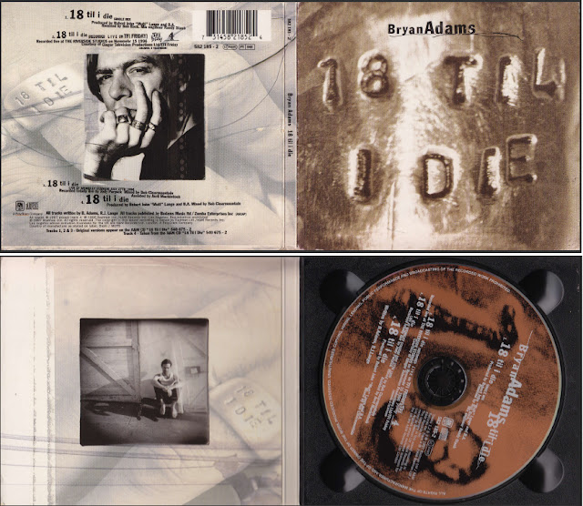
 The scanner was a very useful bit of equipment in the research stages, as we researched existing examples of digipaks and also magazine adverts.


Construction and Exhibition:
FILMING

Although we were only able to access Youtube from home, it was still a crucial resource for our research and planning, as it provided a means of watching almost any music video we could think of.
As it is global and anyone is free to upload to youtube there is a substantial range of music videos available to share and watch.
Also, the fact that anybody can access Youtube means that people are able to comment on your videos and give their opinions and feedback on your work.
Their embedding tool also meant that we were able to upload these videos to our blogs, and this provided a simple solution to exhibiting what we were watching and annotating directly to the annotations in text underneath.
An example which I have used in evaluation question 3 [HYPERLINK] is our target audience feedback which we did in the research and planning stages, and on this we used the annotation tool which is something which only youtube has to offer. It is a very direct and effective way of adding notes to work on video.
Vimeo is very similar to youtube, but has some limitations. However it did allow us to get around the fact that we were unable to access youtube in school.
Vimeo provides the same uploading service as Youtube, although it doesn't offer the annotation tool and also doesn't have as wider user base as Youtube and for that reason we didn't gain any audience feedback from Vimeo via commenting.
Vimeo also offer a service through which you are able to upload large HD files which you must pay for, whereas Youtube offer this for free, so we had to use Youtube to upload our HD footage final cut to the internet instead of Vimeo.
Scribd was used predominantly as a method of uploading microsoft documents to our blogs, for example:
My original music video pitch
work, such as documents, image etc and turn them into HTML which we can then embed to our blogs, making them even more interactive.
 This social networking sight was great in the planning stages of our production, as we used it to arrange the filming of our rave scene. Although in the end we did cancel it it still provided a quick and easy method of contacting large numbers of people we know to let them know of the event and invite them to come along. Seen as facebook has become so popular recently, highlighted by the film 'The Social Network' which is based on the creation of this website, it seems as though any person you meet has a facebook account. This meant we were able to invite a lot of people, and had we stuck to this arrangement could have potentially got a lot of extras involved.
The planning of this can be found on this blog post: http://emma-graveling-musicvid.blogspot.com/2011/01/date-for-filming.html
Using E-Mail we were able contact the right holder to the track 19/2000 quickly and easily, without having use a telephone or write and post a letter. We were also able to keep a record of the E-Mail we sent, and therefore could upload it to our blogs to evidence that we had followed the brief.
E-Mail isn't very recent technology therefore by now almost everyone is accessible via E-Mail, this meant that we definitely could use it for the purpose of contacting the rights holder.
We uploaded it to our blogs using Divshare. This is another website through which we could upload and embed bits of our work
Here is the E-Mail we sent
- HD Cameras
The access to the high definition cameras, which produce a much better quality of footage, meant that we were able to do our locating scouting with an accurate interpretation of what the resulting footage would look like.
- Scanner

 The scanner was a very useful bit of equipment in the research stages, as we researched existing examples of digipaks and also magazine adverts.
Although we were using 'old media' in the form of print text, the scanner meant that we were able to upload the images to the blog and annotate them, in order to compile a list of common conventions.

The scanner was also useful in the planning stages, as it meant we could draw out our storyboards by hand, and then scan them in to put on our blogs in order to showcase how we were working through the planning stages.
- Podcasts and Vodcasts
Using the macs, we were able to create podcasts and vodcast throughout the planning stages of our production. They were a good method of keeping our blogs up to date with the processes of planning.
We used vodcasts at every available opportunity and found using a camera very useful for things such as:
- casting
- location scouting
- initial ideas
We used vimeo, in school to convert these into HTML format in order to upload them to our blogs directly, which was very quick and easy.
For the podcasts we would have used Divshare, although there was a problem with the format so instead used Tinypic. This was disappointing as it created a large video size player and this looked less professional.
- iMovie
iMovie, was a good piece of software for editing our vodcasts as we had prior experience of using it from last years production task. This meant that we were able to create the videos relatively quickly and easily. We could put in relevant images, and footage from other videos and then edit the audio by extracting it and laying it over.
- USB's

The USB memory sticks were useful in transferring documents directly from one computer to another, this was very useful when working in a group as it made it easier to share work.
The USB port in the macs was also used when uploading footage from the cameras as well.
The internet in general was by far the most useful resource we had access to in terms of doing our research, as almost anything is reachable via the web.
Search engines such as Google are a quick and effective method of finding almost anything you require, as well as images which can be posted onto the blogs and transform a blog of text into a mulitmedia post. If we had had only books as a resource for research, i think that would have been very restricting, and left us with less varied and in-depth research.
Also without blogger we wouldn't be able to make an example of our range of skills within this subject and using technologies.
Construction and Exhibition:
FILMING
- HD Cameras
The use of High definition cameras meant that our final product was of much better quality, this means it is more realistic in the sense of creating a real music video, as existing examples of music video in the recent past have moved towards high definition and therefore, we are keeping up to date with this change in trend within the music industry.
The use of HD also helped us to film things which in the past we would have been unable to. An example of this is the difficulty we would have had on achieving focus on a text message from a mobile phone screen with a standard camera whereas with the HD cameras we were able to achieve this which meant we could use a texting scene in our narrative.

The HD cameras had all the same features as the mini DV cameras with the addition of aperture and shutter speed, which were useful when filming scenes in which the lighting was either too light or dark.
- SD Memory Cards - USB's
One of the problems we had with recording on the mini DV cameras was that sometimes the footage on the tapes was recorded over when they were rewound to far. The HD cameras store footage on a memory card, and this solved this problem. They also had a larger memory space so more footage was able to be recorded and stored.
- Fish-eye Lens

This is a type of shot which we haven't used before, in order to create it we had to buy a fish eye lens cap and fasten it onto the camera. We did this using tape due to trial and error, this was the best method as the lens didn't fit onto the camera completely
Some of the inspiration to do this came from the teen drama skins. As this programme targets a similar audience to our music video it makes sense that if it is appropriate for them to use it is equally as appropriate for us.
- Snorricam
The snorricam, again was something which we haven't used before. We used a home made version created by Callum Moreman. - [Link to how he built the snorricam]
- Final Cut
As I wasn't as well involved with the editing of the video this year, Beth learnt how to use the editing software final cut to a higher level than myself.
Her evaluation of Final Cut was this:
This year, instead of using iMovie to edit our production, we have used final cut. This is a more advanced editing software, giving more control over editing, more special effects and the availability to layer various numbers of footage.
Some editing techniques we have used are:
Layering a sequence, using an opacity of around 50%, so there is a faded image on top of another.
Transitions such as additive and non additive dissolve, where the colouring between the two clips dissolves into the other image, and creates a nice dissolve effect.
Lens flare has been affective in our rave scenes, to add an interesting affect to the scenes, and create a transition between normal and fisheye footage.
Trails on the skateboarding, gives a motion blur/slow motion effect, which is a bit more interesting than the plain footage.
Issues with final cut came through right at the very beginning, when I'd only had about 2 hours practice at the Bradford Media Festival back in October. So had to teach myself how to use, which was a matter of trail and error; which considering the short time that we had to edit, meant a lot of time was put into the editing process.
- Scanner
As we were creating our own cartoon imagery for both the ancillary texts, we chose to draw them out by hand. This meant that the scanner was crucial in turning them from a drawing into a format which could be digitally edited.


The editing of the ancillary texts was done using the programme Photoshop. Basic editing programmes such as Windows Paint are far less advanced and offer less options for editing that photoshop, which works on a basis of layers which allowed us to edit things separately and add things in without having to alter backgrounds etc.
Using Photoshop was much quicker and produced more professional results than more basic editing software which was important in creating our ancillary texts as they had to match the quality of the music video to create a successful package.
Although it took a little training to adjust to using Photoshop both Beth and I has prior experience with the programme from last years media coursework poster and in other subjects such as art.

- Youtube and Vimeo
Every rough cut we made was uploaded to Youtube and Vimeo. This meant that we were able to gain some audience feedback via commenting.
This is the audience feedback we got on our final draft:


This is the audience feedback we got on our final draft:

On this final draft Beth also added annotations, which helped to show which sections would be altered in the very final cut. This meant people would be more easily able to give feedback as they would have a more accurate reading of the text.
This cut was also uploaded to Facebook, which recieved a higher number of comments for feedback. I think this was due to it being more personal. Facebook also offers the option to 'Like' videos which again is positive feedback.

This feedback highlighted how some people may not detect our preferred reading although very few other people had this problem, so it isn't something we feel needs to be edited differently.
The final cut which was uploaded to Youtube received one very detailed and well criticised comment,
" I think this pretty good actually, the storyline works well in a nicely circular fashion, the effects for the skateboarding and the final party scene were good. If I'm going to be really critical, the lighting could have been better in some of the house scenes, and the party at the end needed a little more flow, it seemed a little stilted/staged.
Overall though, this is a good effort, would it work as a video with professional production standards - absolutely yes, good job."
which shows how useful the site is in gaining audience feedback, however we were unable to use that feedback after it was left on the final cut.
- USB's
Evaluation Question 3
What have you learned from your audience feedback?
The first bit of audience feedback we did was to narrow down our target audience, and discover whether the age group we thought would like the 19/2000 Soulchild remix which was between 15 - 24, actually did.
We had thought this would be our target audience mostly because of the genre, hybrid between hiphop and dance. Original Gorillaz fans would be quite a bit older than 15-24 now as the band first released records in 1988. Though as were not using an original Gorillaz track we figured they're not our main target audience, however they could be a secondary target audience.
We used a quick questionnaire to find out whether students aged 17-18 recognised the record, if they could establish which genre it is and if they liked it. We filmed their responses and uploaded the video to Youtube, and then annotated using the annotation tool.
which matches what we had previously thought in terms of target audience and therefore helps us anchor that.
The first bit of audience feedback we did was to narrow down our target audience, and discover whether the age group we thought would like the 19/2000 Soulchild remix which was between 15 - 24, actually did.
We had thought this would be our target audience mostly because of the genre, hybrid between hiphop and dance. Original Gorillaz fans would be quite a bit older than 15-24 now as the band first released records in 1988. Though as were not using an original Gorillaz track we figured they're not our main target audience, however they could be a secondary target audience.
We used a quick questionnaire to find out whether students aged 17-18 recognised the record, if they could establish which genre it is and if they liked it. We filmed their responses and uploaded the video to Youtube, and then annotated using the annotation tool.
From this we found that on the whole people recognised the song but were unable to tell us the artist or song title, unless they were existing Gorillaz fans. This was disappointing although the majority claimed to like the track and therefore still matched our thoughts on target audience.
Their feedback on what they expected to see in a music video for the track was useful because some of their ideas were very similar to our own. This would suggest that a person of that age would like our music video and find it authentic.
We never gained any audience feedback from a possible secondary audience, out of our target audience age range. Perhaps if we were to re-do the research and planning we could have gained some feedback from an older audience, to see how they would respond, and whether they would follow a preferred reading of the video. However their feedback wouldn't be as relevant because they aren't our primary target audience.
Our audience feedback for our music video was sought from various sources:
- Class screenings
- Screenings to other media students
- Screenings to our year group and also the year below
- Youtube
Each of these resulted in different types of audience feedback, for example:
- Media students were happier to constructively criticise our work meaning we could use there feedback to improve our work.
- Screening the video to the students in other media classes whilst we weren't present resulted in even more criticism which suggests perhaps our class were trying to be nice to beth and myself.
- Although one positive with screening to the other class was that they hadn't seen our work as many times as our own class which meant that they were giving feedback in a more realistic setting as opposed to our class who seemed to be analysing every detail which wouldn't happen with a general viewing in the real world.
- Other sixth form students in general were less willing to criticise, we could however ask them specific questions such as 'do you follow this reading' and see whether they responded positively or negatively.
- Very few people gave feedback via Youtube, which meant that it was difficult to use their feedback for any specific purpose, though we in total received 3 positive comments and 6 likes on the final draft and final cut out of a supposed 431 views.
- Facebook friends were more willing to give feedback although due to the social aspect of the site not all of it was necessarily feedback on the video, friends were also less likely to criticise.
- Youtube users who left comments are anonymous so we were unable to tell what age group was giving us audience feedback.
- Facebook was better for this, as the comments left were from friends aged within our target audience group 15-24.
- However Youtube offers a statistical view of the video views from other people which tells us whether they have been linked from Facebook which is a good sign that uploading it to that social networking site was a good choice.
- Youtube also provided us with this statistic:
Audiences - This video is most popular with:
| Gender | Age |
| Male | 13-17 |
which matches what we had previously thought in terms of target audience and therefore helps us anchor that.
The music video:
After gaining audience feedback from a small group of students in the other media class with which we ran through our entire music video in detail we gained this audience feedback:
These are the suggestions they made as to what we could edit and improve upon:
Here is the screening of our final cut which we presented to a group of sixth form students which fits our target audience age range.
Following this screening it is clear that there is little left to be done to improve our video and therefore we can use it as our final cut.
- Cut back to the phone ringing and add in SFX to the shots to mimic the vibrations of the phone, in the opening scenes of mise en scene close ups.
- Also add diegetic sound of the phones vibrations.
- Reverse the shot of the light bulbs to focused, then blurred, as this will tie better with our central protagonist, Callum waking up.
- Alter the sequence of shots to mix both mise en scene, bottles and cigarette packets etc with the extras cast asleep.
- Add more lip-syncing as Callum gets dressed.
- More shot variation during the fridge scene.
- Possibly add a close up shot of Callum opening the can, and using SFX put his face on the can lid.
- Possibly repeat the motion of the fridge shutting to match the beat, similar to the repetition of Callum running down the stairs
- Overlay Callum taking the cigarette of the girl sleeping on the floor to mask the slight shake of the camera
- De-saturation of red hues on the skateboarding scene
- Add more ghost trails on the long shots from the skateboarding scene or possibly just on the jumps
- Re-shoot the shot of the CD player in the car
- Add shots of the road, to increase shot variation in the car scene
- Re-shoot the scene in which Callum and Simon arrive at the party, as the shots are too long, they're poorly framed and they don't flow well into the next sequence of shots from the house party.
- Mix together shots of the rave and the kitchen scene with fast pace editing to create a more slowing transition.
- Alter the main shot of transition from our cast member Megan, to the DJ, to a transition of Megan to Megan down in the rave which would flow better.
- Layer some of the HD shots from the rave
- Link the HD shots to the fish-eye lens by panning down into a bottle creating a circular frame which is similar.
- Also improve the transition between the fish-eye lens and the scene with Callum and our female cast member Vicky going upstairs in a similar way.
- Re-shoot the ending to make it less abrupt, we will film Callum putting his hand to the camera to signify the end.
Here is the screening of our final cut which we presented to a group of sixth form students which fits our target audience age range.
Following this screening it is clear that there is little left to be done to improve our video and therefore we can use it as our final cut.
The ancillary texts:
YOUTUBE VIDEO HERE
YOUTUBE VIDEO HERE
Digipak

It was said that the theme of our digipak ties in well with our advert which is positive as this shows that our audience feel that the two work well together as a package despite the imagery not being identical.
However it was suggested we could further improve the links between the two by matching some of the colours etc.
There was a suggestion to tie in the youthful image and graffiti with the album texts with a spray can effect so we aimed to create a convincing spray can effect as we thought it was a great idea. To anchor that it was graffiti style we also added in an outline of a spray can.
The sticker idea was also mention in this audience feedback session which is something which we chose to add to our digipak as it is an easy way to add any extra information about the special edition digipak which is separate to everything else. Also, as the sticker is a common convention of existing digiapak and CD cover examples, using the same technique makes our digipak look more authentic, like the real life examples.

This was the draft our our digipak which was discussed in the video.
From this audience feedback it was clear that on our digipak we were missing a lot of the small details which go into creating a CD cover. For our final digipak we had to add all these in to make it authentic and like a real digipak production which was our brief.
It was said that the theme of our digipak ties in well with our advert which is positive as this shows that our audience feel that the two work well together as a package despite the imagery not being identical.
However it was suggested we could further improve the links between the two by matching some of the colours etc.
There was a suggestion to tie in the youthful image and graffiti with the album texts with a spray can effect so we aimed to create a convincing spray can effect as we thought it was a great idea. To anchor that it was graffiti style we also added in an outline of a spray can.
The sticker idea was also mention in this audience feedback session which is something which we chose to add to our digipak as it is an easy way to add any extra information about the special edition digipak which is separate to everything else. Also, as the sticker is a common convention of existing digiapak and CD cover examples, using the same technique makes our digipak look more authentic, like the real life examples.
Magazine advert:

From that class discussion it was suggested that we:
This was the draft of our magazine advert which was discussed in the video.
From that class discussion it was suggested that we:
- Use the same pink text on more of the white text.
- Make the text on the digipak features stand out more, for example: in shape of a record.
- Re-order the writing as it is a little squished up.
- Compress 'THE REMIXES' so that the edges of the letters aren't lost.
We gained less audience feedback from our ancillary texts as the process of producing them took less time, also we only gained feedback from media students. Given more time I think it could have been beneficial to gain more audience feedback by possibly uploading
Thursday 14 April 2011
Sunday 27 March 2011
Evaluation Question 2
How effective is the combination of your main product and ancillary texts?
Our brief was to create a promotional package for the release of an album, including a music promo video, digipak and magazine advert.
 In the real world we found whilst in the research and planning stages, that separate companies can be responsible for the designing and production of these. Companies such as WeWow for example would be empoyed by a client to design and create an album cover.
Again, another different company would be employed for the design of a magazine advert and also the production of a music video.
Examples of this:
Lightenginefilms - Music video production company
This company would use a clients own ideas when creating a music video, though they may possibly have influence over the production with their own ideas and advice.
They charge £800 for a 2 hour shoot of a performance music video in one location, up to £3000 which includes much more options such as GCI and various locations for shooting.
The company does the planning with the clients assistance, the shooting, the editing. They provide the client with a DVCAM tape, data disc and DVD, they also offer help in putting the video onto youtube/vimeo etc and can submit the video for television air play.
 For the advert a client may go to an advertising agency, such as, The Image Works LTD who would offer a service to the client in creating and producing a print advert for a magazine. Then the client would have to contact a magazine to put their advert in and pay a fee which is dependent on the magazine and size of advert. For a full page in Q magazine costs £9,156.
A company such as WeWow would offer a design service for the album artwork as well as the production of an album case. This shows how the production of all three different products is entirely un-linked and how in the real world it would be possible for each to not create an effective combination. In order for them to wrok together there must be a reccurring theme with each which compliments the band or artists own image.
Untitled from emma graveling on Vimeo.
From audience feedback we were told that the image of a DJ works well to link the remix aspect of the album. And also that the digipak design looks to have been well thought out and is eye-catching. The contrast of black and white on the advert with the little bits of colour also works well to make it stand out. This is all positive, although given perhaps more time or rescources, we could have produced a higher quality of graphics which would have made the ancillary texts of a better standard to match the high quality of the music video.
Our brief was to create a promotional package for the release of an album, including a music promo video, digipak and magazine advert.

Again, another different company would be employed for the design of a magazine advert and also the production of a music video.
Examples of this:
Lightenginefilms - Music video production company
This company would use a clients own ideas when creating a music video, though they may possibly have influence over the production with their own ideas and advice.
They charge £800 for a 2 hour shoot of a performance music video in one location, up to £3000 which includes much more options such as GCI and various locations for shooting.
The company does the planning with the clients assistance, the shooting, the editing. They provide the client with a DVCAM tape, data disc and DVD, they also offer help in putting the video onto youtube/vimeo etc and can submit the video for television air play.
 For the advert a client may go to an advertising agency, such as, The Image Works LTD who would offer a service to the client in creating and producing a print advert for a magazine. Then the client would have to contact a magazine to put their advert in and pay a fee which is dependent on the magazine and size of advert. For a full page in Q magazine costs £9,156.
 A company such as WeWow would offer a design service for the album artwork as well as the production of an album case. This shows how the production of all three different products is entirely un-linked and how in the real world it would be possible for each to not create an effective combination. In order for them to wrok together there must be a reccurring theme with each which compliments the band or artists own image.
Untitled from emma graveling on Vimeo.
From audience feedback we were told that the image of a DJ works well to link the remix aspect of the album. And also that the digipak design looks to have been well thought out and is eye-catching. The contrast of black and white on the advert with the little bits of colour also works well to make it stand out. This is all positive, although given perhaps more time or rescources, we could have produced a higher quality of graphics which would have made the ancillary texts of a better standard to match the high quality of the music video.
Friday 25 March 2011
Evalutation Question 1
In what ways does your media product use, develop or challenge forms and conventions of real media products?
Music video:
Conventions of music video, across the genres:
Evaluation question 1 from emma graveling on Vimeo.
PODCAST: Genre specific conventions
Untitled from emma graveling on Vimeo.
Digipak:
Common conventions of Digipaks:

This matches the common conventions of digipaks such as:
This matches the common conventions of magazine album adverts such as:
Music video:
Conventions of music video, across the genres:
- Tend to fall into one or more of Goodwin's music video categories: Narrative/concept/performance.
- Editing is usually cut to the beat.
- Variety of shot types such as: close ups, establishing shots, high/low angles, panning shots, tracking shots.
- Main focus is usually on lead singer of band or solo artist.
- Mise-en-scene tends to link to style and genre of the band/artist.
- Diegetic introductions/endings or throughout the rest of the video.
- Lack of titles or other anchorage in text format - eg.artists and song titles are usually added by music channels.
Evaluation question 1 from emma graveling on Vimeo.
PODCAST: Genre specific conventions
Untitled from emma graveling on Vimeo.
Digipak:
Common conventions of Digipaks:
- Artist/band name and album title on front panel and spine
- Image of artist/band or computer generated imagery
- Disc in tray or slotted in the sides
- Recurring theme and/or imagery throughout all the panels
- Track listing on the back panel
- 'Special Edition' sticker
- Barcode on back panel

This matches the common conventions of digipaks such as:
- Computer generated imagery - due to the cartoon style of Gorillaz we stuck with that theme, instead of using photography of our central protagonist as he isn't embodying a lead singer for the band.
- We have the band name and album title on the front panel and the spine, we also have it in the middle to tie the theme throughout the panels.
- As well as that we have tied the imagery of the bricks throughout and also the imagery of the speakers and the black graffitti style text.
- We have included a track list on the back panel.
- We have chosen to slot discs in the side because there are 2 discs, one CD and one DVD.
- We have used a 'special edition' sticker
- We have put on a barcode
Magazine Advert:
Common conventions of magazine adverts can be seen on my blog post researching the conventions of existing magazine album adverts: http://emma-graveling-musicvid.blogspot.com/2011/02/mag-ads-for-digipaks-draft.html
What we found, in short, was:
General Codes and Conventions of Magazine Album Adverts -
- include Band / Artist name
- include album title
- give a release date
- inform of available formats
- include a web address
- advertise songs it includes
- advertise where to buy album
- match imagery to album cover or use photographs of album cover on advert
Our final ancillary magazine advert:

This matches the common conventions of magazine album adverts such as:
- We have included the Band name and album title.
- We have given a release date 'JULY 2011' (festival season).
- We have given information on which formats it would be available in, we included vinyl as this has risen in popularity.
- It advertises the song '19/2000 Soulchild remix' as we believe this is the most well known song, and is the track we chose to create a music video and therefore should be effective in advertising the album.
- We included a link to iTunes, a place to download the album.
- We have challenged the common convention of matching advert imagery to album artwork, instead we have used a small image of the album on the bottom right hand corner of the advert and a different image on the main section of the advert.
Our Digipak - final design

This is our final design for the cover of the digipak.
Although there is more information needed about the digipak which we need to put onto the front panel, which we have chosen to do in sticker format.

This is the sticker.

This is our final design, with the sticker included.
We chose to put it on the speaker as it doesn't obstruct any other text here, and the circular design fits with the shape of the speaker.
Sunday 20 March 2011
Our Magazine Advert
We decided to stick with the theme of using cartoons which beth and I drew ourselves, for the album advert and the digipak cover. This means that our digipak and magazine advert tie together as a package.
As the album is for a compilation of Gorillaz remixes, we chose to draw a picture of a DJ at a mixing table, which ties the theme of remixes and the imagery of the advert together.
After researching the existing examples of magazine adverts from Q magazine, we narrowed down what need to be on the adverts. This included:


The feedback we gained on this 2nd draft was that the colour of pink/purple on the text is "perfect".
The combination of only 3 colours are "simple yet effective".
It looks professional
They like the graffitti style of writing on the Gorillaz
The advert is in keeping with the 'youthful' style of the digipak
They also suggested that we should:


As the album is for a compilation of Gorillaz remixes, we chose to draw a picture of a DJ at a mixing table, which ties the theme of remixes and the imagery of the advert together.
After researching the existing examples of magazine adverts from Q magazine, we narrowed down what need to be on the adverts. This included:
- The band or artists name
- The album title
- A release date
- Available formats
- A web address
- Advertises songs it includes
- Advertises where to buy album
The audience feedback we gained from this was that the theme of remixes and the DJ imagery works well, but it was also suggested that we definately need to add some colour.
Also that the date shouldn't be larger than the album title.
An advert or link to a place where you can purchase this album such as iTunes, Amazon, HMV etc.
It was suggested we could add some information on what the special edition digipak includes.
It was also suggested that festival season would be a better date to advertise the release date.
And due to the increase in popularity recently of vinyl, we could add that as another available format of the album.
Here is our second draft:
I have added to this, colour which matches the digipak, as it is a common convention of magazine album adverts for the imagery to match the album artwork, although we have challenged this convention as our album artwork doesn't match the advert I have also added an image of the album, so that an audience would know what to look for when purchasing the digipak.
I added the small image link to iTunes, beacause after a quick survey of asking people if they owned an iPod, most of which did and also wether they use iTunes to download music or listen to their music files on their computers, again most said that they had and did. Therefore iTunes seemed like the most popular choice. It also adds some authenticity to the advert.
Finally i added the small section on what the digipak contains, for which I took inspiration from existing examples of bonus features.
I hope to upload this and our digipak to facebook in order to get some audience feedback from a variety of age ranges but mostly our target audience, and find out whether they think our digipak and magazine advert work well and are effective in drawing in the target audience.The feedback we gained on this 2nd draft was that the colour of pink/purple on the text is "perfect".
The combination of only 3 colours are "simple yet effective".
It looks professional
They like the graffitti style of writing on the Gorillaz
The advert is in keeping with the 'youthful' style of the digipak
They also suggested that we should:
- Use the same pink text on more of the white text
- Make the text on the digipak features stand out more, for example: in shape of a record.
- Re-order the writing as it is a little squished up
- Compress 'THE REMIXES' so that the edges of the letters arent lost
Here is our third draft:
Here we have edited the sections which we were told needed some work from our audience feedback.
However Beth and I have decided we dislike the text in the shape of a record, we don't think this works well so with our next draft we will straighten that back out again. Other than that we are happy with this design.
Here is our final design:
The audience feedback we gained from this deisgn helped us decide that this was the one we would use as it wasn't suggested anything needed changing and also that it looks proffesional.
Tuesday 15 March 2011
Digipak design

We picked this design as it has 2 sections to slot in CD's, therefore we can put the DVD of the music video in one side and the remixes CD in the other.
We tied the design of the digipak together by using the same background and writing style throughout, hopefully this makes it look more professional.
Friday 4 March 2011
BC - The Editing Process
Here is some brief notes regarding some of our decision making in the editing process of our music video.

Changes made after second rough cut


- Originally the skateboarding scene was going to be majority snorricam, but as that seemed slow and quite dull, I broke it up with clips of him doing tricks. - Possible chance to shoot extra footage and add in more shots of him from different angles.
- The lighting whilst using the snorricam was very dark on his face, so using the editing tools, gamma, brightness and contrast, I have made it slightly lighter so it's easier to see his face.
- Added affect on Callum as he leaves the house and jumps on skateboard - ghost trails - which add the sense of fast movement in slow motion.
- Added a transition from the table & ring of fire to Megan and Nick doing a shot to signify a time change.
- Non additive dissolve - "Compares the pixels in the two clips and displays the lighter of the two as the first clip fades out and second fades in"
- Same transition used from the shot of Megan to the 'rave' scenes.
- Overlap of clips and 50% opacity on the sequence of Callum and Vicky going up stairs to connote a drunken memory - blurred and no correct order to sequence of shots, all just on top of each other.

Changes made after second rough cut
Our second rough cut featured all of our footage, with basic editing by being cut to roughly the right length and in the correct order. After getting some feedback on our second rough cut, and most people saying that they liked the footage, Emma and I then went back to Final Cut and started our final stages of editing.

- Cut and reverse. When Callum goes down the stairs, to make the shot a bit more interesting rather than one long take, we have cut and reversed 2 of the sections, in time to the beat of the song, to make it a bit more in sync with the song.
- Tighter cuts on the sequence of Callum going to the fridge, making it flow more smoothly.
- Instead of having the lip syncing in the car one continuous shot, we have split up the shot with some cut away shots, which in our second rough cut we had at the end of the sequence. This creates some more shot variation in the sequence.
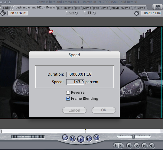
- Getting out of the car - before I had cut the long pause between the car lights turning off and them getting out of the car. Dave picked up on the slight jump in editing, and so instead of cutting, we have split the clip into 3, and have the middle section sped up to around 140%, which I think gives a nice, subtle effect along with the part of the song as a cloud lifts and the lighting on the car shifts. (easier to see visually than explain)
- From audience feedback, we were told that the transition from normal lens to fisheye wasn't very smooth. After playing with some different effects, we have put on Light Rays effect, which distorts the image with bright rays of light. Using this affect on the shot of the DJ, and then the beginning of the fisheye clip, creates a more subtle transition as well as a time ellipsis effect.

- The ending of the video, where Callum and Vicky go upstairs, the lighting seemed really bright and a bit unreal in the situation of a house party and so using the Desaturate effects, I changed the colouring a little bit, just to make it match the rest of the footage more.
There have been times where we've had to choose between different editing effects.
Some have been more simple, with something like the order in which shots appear, others needed a little bit more thought over, with the various effects available on Final Cut.
Here is an example of two clips which we have had to decide over.
Whether to keep it simple sequence which visually is easy to follow, or instead use effects to create a visual representation of the situation - being drunk.
Thursday 3 March 2011
BC - Gorillaz album artwork
Formed in 1998, Gorillaz' first album came out in 2001. Named Gorillaz, their first album consisted of some of there most well known tracks.
 Their first album is a graphic image of the band in the same 'geep' as featured in the 19/2000 music video. The album art is simple, with just the car on the white background and the band name tagged in graffiti, and the parent advisory.

In 2002, Gorillaz released the compilation G-Sides.
As a 'B-Sides' Collection to their first album, featuring the additional tracks from their first three singles and the Tomorrow Comes Today EP.
This is the album in which 19/2000 SoulChild Remix first came out on, as the first song on the album.
All versions have the same cover, featuring Noodle with a skeleton doll in her hand, except for the Canadian, Japanese and Australian versions. [Wiki]
There is similar aspects between this album cover and their previous, such as the graffiti style writing on Gorillaz, and the cover featuring all the band members, even though there is the one that is in the foreground.
 Laika Come Home is another compilation released in 2002.
It isn't a typical remix album, and instead of having variety of artists remixing the songs, is done by just one group, Spacemokeyz.
The album contains most of the songs from Gorillaz' first album, but remixed in a dub and reggae style.
In 2004, the album was packaged with 2001 Gorillaz in a limited edition box set as part of EMI's "2CDs Originals" collection.
The album cover is different to the usual artwork of Gorillaz, the imagery is of a space monkey, on the background of a map of the stars, edited with text such as 'Spacemoney versus Gorillaz'.
There is also a sticker added on to this version, in which some images of the album art work don't have. The sticker gives an insight into the album, with the band, remixers, a brief description and other artists that it features.

Demon Days is the second studio album, released in 2005.
The album cover is reference to Let it Be by The Beatles.
Featuring all 4 members, and moving away from the graffiti band title, but staying quite simple in the imagery.
Like G-Sides to Gorillaz; D-Sides is the B-side album to Demon Days.
Released in 2007, D-Sides contains remixes and B-side tracks.


'Have a look at this exclusive image of the contents of the D-Sides deluxe package below! In one of Gorillaz most spectacular packages yet, there are plenty of goodies to be had with this 2-disc set. In addition to fantastic new images from longtime Gorillaz friend and collaborator Jamie Hewlett, the amazing box also features a patch and more new stickers! Also note that the release date of D-Sides has been amended to 19th November in the UK and 20th November in the USA.' [Gorillaz fan blog]
 The third studio album, released in 2010 is their most recent album, Plastic Beach.
Comparing to their first album cover, Plastic Beach seems a more graphically animated image as opposed to the simple graphics of the band members.
They also have used different text type to the graffiti style.

The Fall was released on the 25th December 2010, as a free download on the Gorillaz website, exclusively to fans in the band's Sub-Division fan club.
The entire album was recorded on Damon Albarn's Apple Ipad, during part of their World Tour. Plans have been announced for the album to get a physical release, scheduled for April 2011.


In 2002, Gorillaz released the compilation G-Sides.
As a 'B-Sides' Collection to their first album, featuring the additional tracks from their first three singles and the Tomorrow Comes Today EP.
This is the album in which 19/2000 SoulChild Remix first came out on, as the first song on the album.
All versions have the same cover, featuring Noodle with a skeleton doll in her hand, except for the Canadian, Japanese and Australian versions. [Wiki]
There is similar aspects between this album cover and their previous, such as the graffiti style writing on Gorillaz, and the cover featuring all the band members, even though there is the one that is in the foreground.

It isn't a typical remix album, and instead of having variety of artists remixing the songs, is done by just one group, Spacemokeyz.
The album contains most of the songs from Gorillaz' first album, but remixed in a dub and reggae style.
In 2004, the album was packaged with 2001 Gorillaz in a limited edition box set as part of EMI's "2CDs Originals" collection.
The album cover is different to the usual artwork of Gorillaz, the imagery is of a space monkey, on the background of a map of the stars, edited with text such as 'Spacemoney versus Gorillaz'.
There is also a sticker added on to this version, in which some images of the album art work don't have. The sticker gives an insight into the album, with the band, remixers, a brief description and other artists that it features.

Demon Days is the second studio album, released in 2005.
The album cover is reference to Let it Be by The Beatles.
Featuring all 4 members, and moving away from the graffiti band title, but staying quite simple in the imagery.
Like G-Sides to Gorillaz; D-Sides is the B-side album to Demon Days.
Released in 2007, D-Sides contains remixes and B-side tracks.


'Have a look at this exclusive image of the contents of the D-Sides deluxe package below! In one of Gorillaz most spectacular packages yet, there are plenty of goodies to be had with this 2-disc set. In addition to fantastic new images from longtime Gorillaz friend and collaborator Jamie Hewlett, the amazing box also features a patch and more new stickers! Also note that the release date of D-Sides has been amended to 19th November in the UK and 20th November in the USA.' [Gorillaz fan blog]
Comparing to their first album cover, Plastic Beach seems a more graphically animated image as opposed to the simple graphics of the band members.
They also have used different text type to the graffiti style.

The Fall was released on the 25th December 2010, as a free download on the Gorillaz website, exclusively to fans in the band's Sub-Division fan club.
The entire album was recorded on Damon Albarn's Apple Ipad, during part of their World Tour. Plans have been announced for the album to get a physical release, scheduled for April 2011.
Subscribe to:
Posts (Atom)